17 December 2021
We often hear the word normal on the weather report as in: “Today’s high was 64 degrees F with a low of 49F and was 23 degrees above normal.” (That was yesterday’s temperature in Pittsburgh and, yes, it was 23 degrees above normal.)
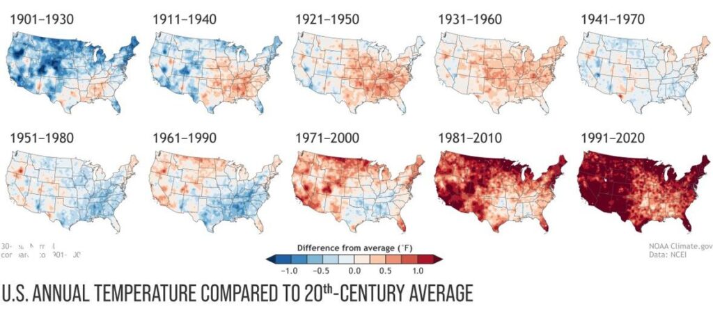
Climate normals are always a 30-year average of temperature and precipitation as recorded at each U.S. weather station. Recalculated at the end of each decade, the new normals announced in May 2021 are based on the most recent 30 years of data: 1991-2020.
Normal is a rolling average and it keeps getting hotter. The 10 maps above compare each decade’s normal temperature to the 20th century’s average. We have moved from cool blue (top left) to angry red (bottom right).
Normal might not feel hot for people in their early 30s because it’s what they remember throughout their lives, but for retired people like me the current normal is the climate of less than half my life.
I remember the snowy Decembers of my youth. Even without the graphs I can tell the normal temperature has changed.
For more information on the current climate normals and the trend in precipitation (which is not trending in one direction), see NOAA, 1 May 2021: The new US Climate Normals are here.
(map from NOAA NCEI)