
27 October 2023
In school we learned geography on flat maps using the Mercator projection. Google Maps uses a version called Web Mercator.
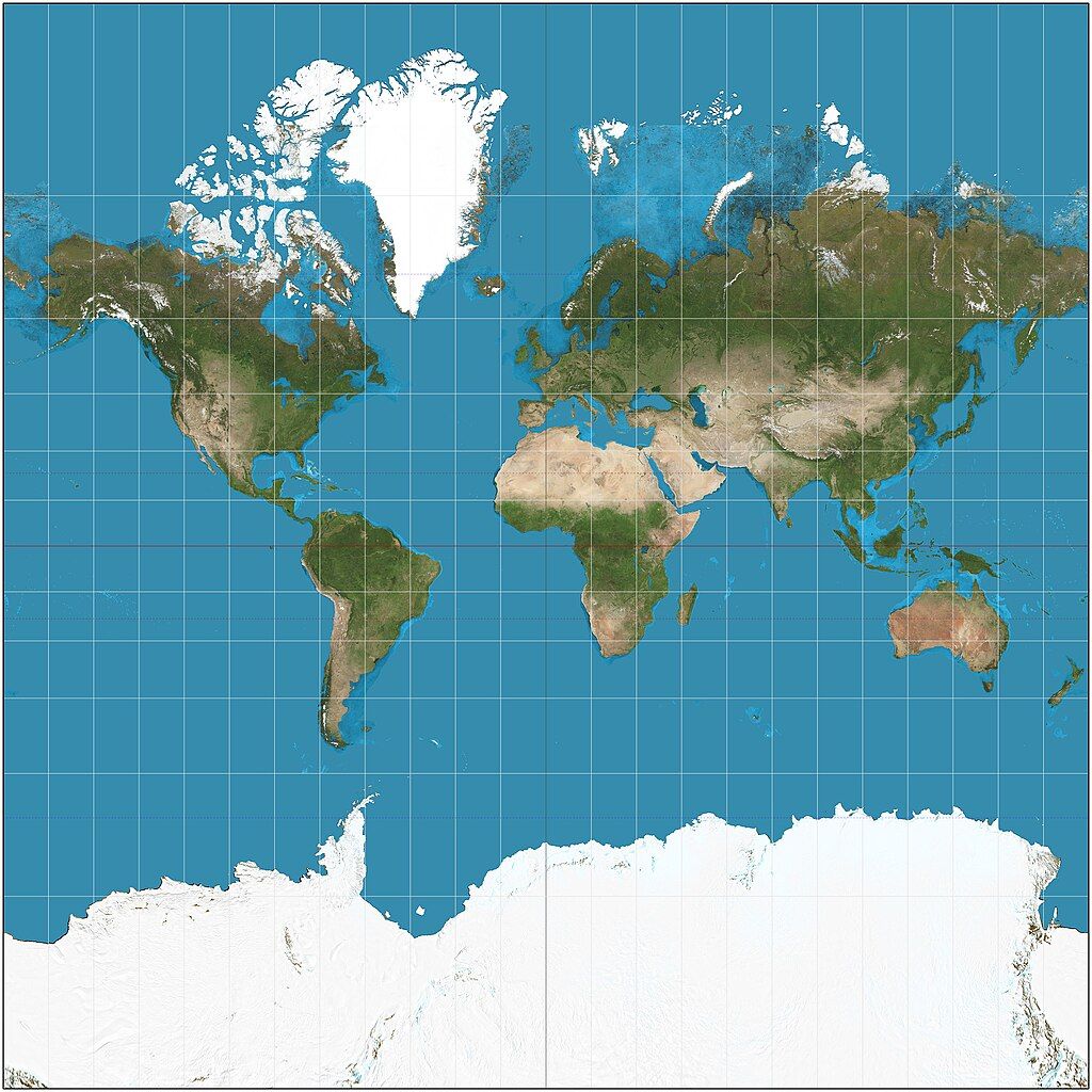
The Mercator projection that transforms our 3-dimensional Earth into 2-dimensions was invented in 1569 for use in navigation, which is why Google uses it. Unfortunately it totally distorts the size of land closer to the poles. It makes Greenland look big, maybe bigger than Africa. New Zealand is often cropped off this map.
The animation at top alternates between the Mercator projection and each country’s actual relative size. Hello, Northern Hemisphere, you aren’t as big as you think you are!
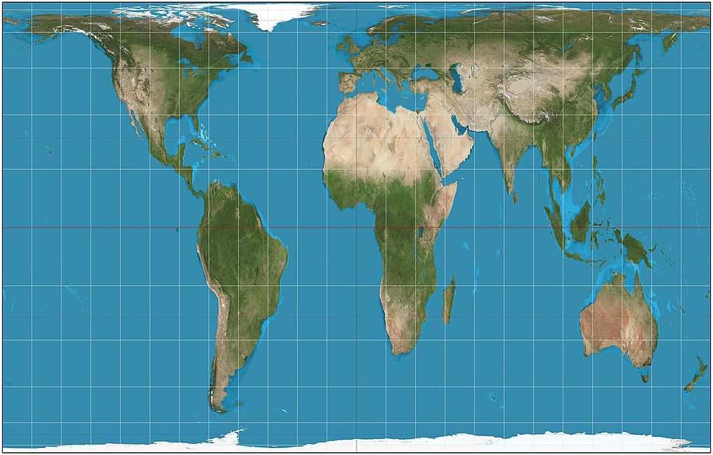
If we correct for size, as in the Gall-Peters projection, we mess up shapes and navigation.
Every flat map has distortions. This 6-minute video explains why. There is no right answer.
Making a flat map of the Earth is like trying to cut an orange peel to make it lay flat on the table. Good luck!
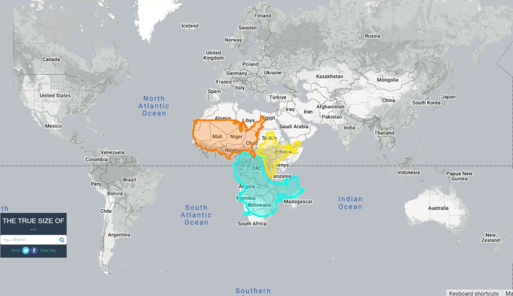
p.s. Here’s a screenshot from the thetruesize.com mapping tool that Johnny Harris mentions at the end of the video. Its initial screen demonstrates that the contiguous U.S. + China + India can easily fit into Africa with room to spare. Try it at thetruesize.com
(credits are in the captions; click on the links to see the originals)